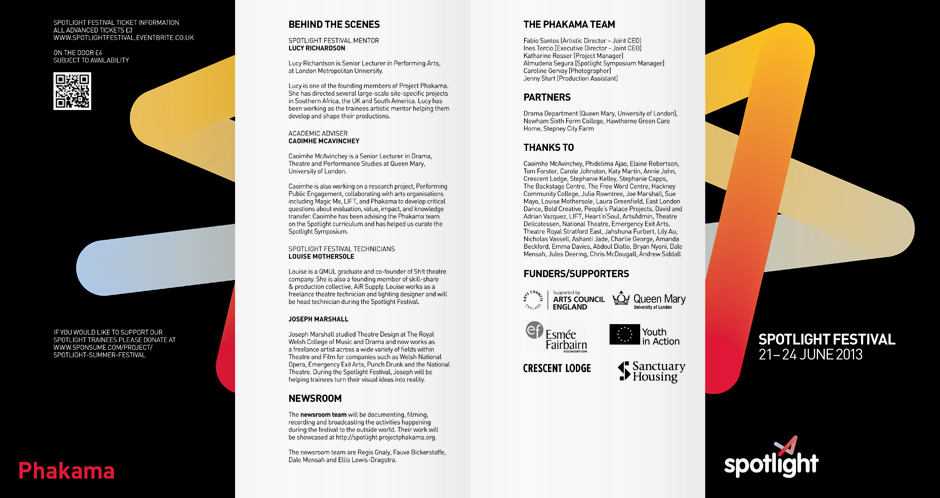
Spotlight

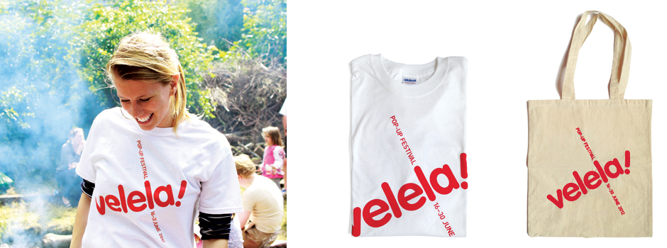
Velela!
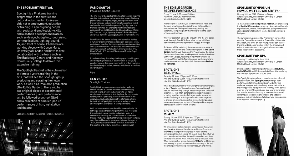
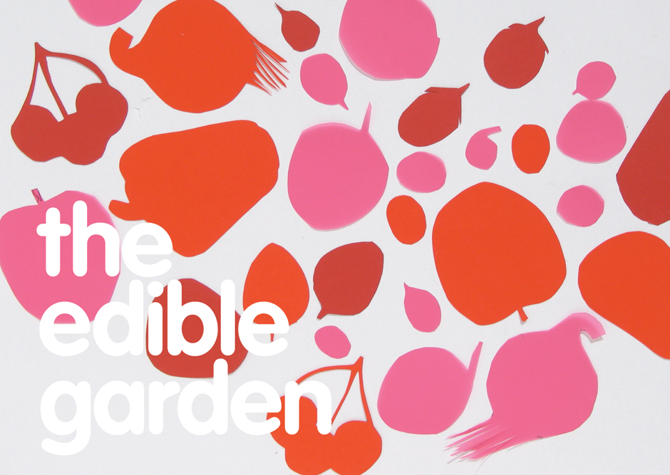
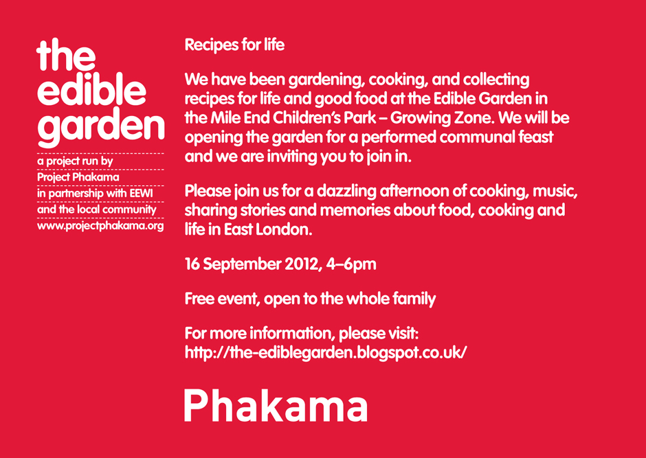
The edible garden
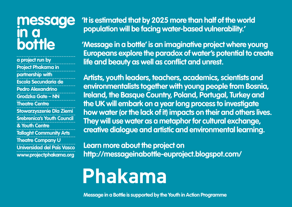
Message in a bottle
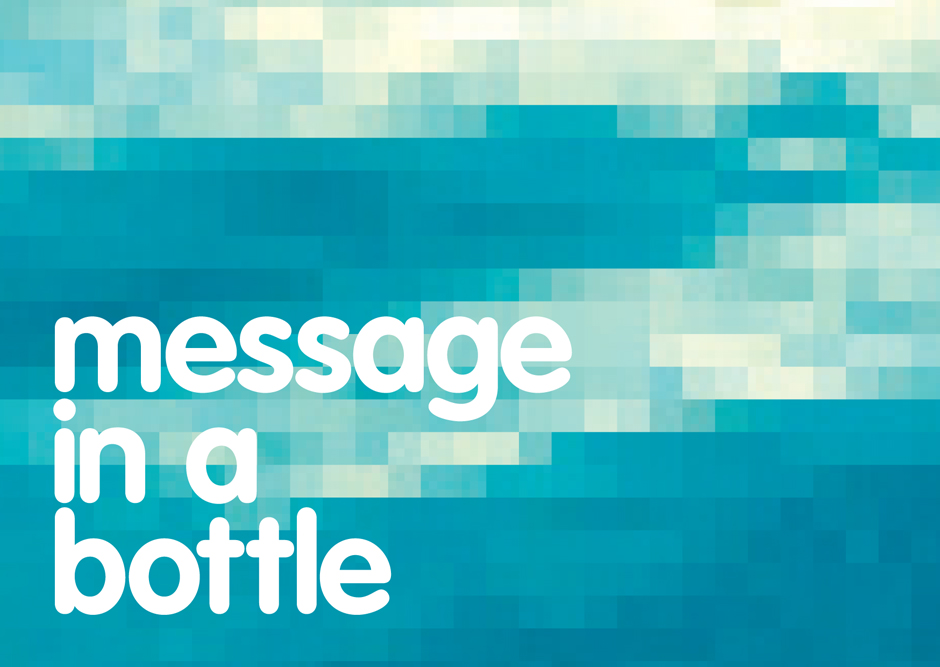
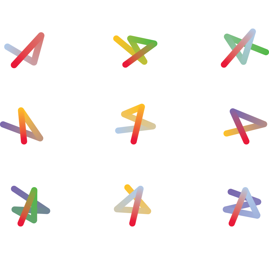
Having designed the Phakama brand identity we now design its projects identities. So far these have included: ‘Message in a bottle’, ‘Edible garden’, ‘Spotlight’ and the festival ‘Velela!’ (‘velela’ means ‘pop up’). All of our work with Phakama hangs together through fonts, colour and original imagery – and, where relevant, the Xosa language, from which came the Phakama name.